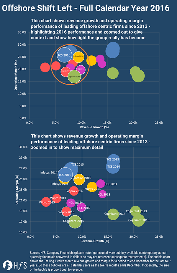
Back in August 2016, we wrote about the shift left with offshore providers – we were recently updated in January. Below is the new chart that updates to include Q4 revenues – we always include a full year of data it is the trailing twelve months – now it represents the full calendar year view for all of the years.
Click here to enlarge the image
Hopefully, the new charts show the shift even more clearly. With the top chart zooming out to show the whole of the y-axis – giving the full margin picture and demonstrates quite how close together the firms really are and highlights the convergence even more. As you can see Q4 hasn’t halted the shift and we see these companies cluster around the high single digit growth mark.
The Bottom Line – we’ll have the full roundup at the end of the month
This is just a taster of the results, once all of the quarterly results have been published we will collate them and produce our full quarterly roundup. We can then see the offshore shift left in the context of the other providers.
Posted in : IT Outsourcing / IT Services